
Update: We have a new contender… Anne Fine, a long-time friend of mine, did some noodling around on her own and submitted a whole new cover. Would love your thoughts on it, as well. See below.
One thing every author wants for his or her new book is the best cover possible. One that customers will see and decide they must buy this wonderful new story, because people really do judge a book by its cover.
So I’m doing a little crowdsourcing here. The sequel to my mystery novel Fascinating Rhythm is getting close to being ready for release. I’m hoping all the ducks will be in a row for this summer. But part of that is getting the best cover for the book.
It’s called Bring Into Bondage, and my heroes Freddie and Kathy rush out to Hays, Kansas, and the farm belonging to Kathy’s parents during the summer of 1925. The farm is under attack by mysterious vandals, so Freddie and Kathy decide to stay and find out what’s going on. Trying to stay ahead of vandals who don’t seem worried about killing Kathy and her family is scary enough. But Freddie and Kathy may be in more trouble when Pa Briscow gets the shotgun out.
I’ve got three mock ups below and I’d like you to pick the best cover and tell me why you like it. To make things even more sporting, if you reply in the comments, you’ll be entered in a contest to win a small, but reasonably cool prize: a t-shirt with the winning cover emblazoned on the front, some lovely Robin Goodfellow handcrafted soap, and copies of Fascinating Rhythm and Bring Into Bondage (well, the Advance Review Copy). The final cover will be fixed up (with the help of somebody who actually knows what she’s doing), so it may not actually look like what you picked, but it should be in the ballpark.
Best Cover Contest Rules
Well, such as they are. One entry per person, because I don’t need you to pick all three covers. Relatives are okay, mostly because you’re the ones I can count on to actually enter. The winner will be drawn at random and gets to pick style and size of said t-shirt from the options I’ll provide. Please make sure you’re putting the right number on the cover, since they aren’t shown in numerical order.

Cover #2

Cover #3

In order of preference…#2, #1, #3
Thanks, Barbara! Love that data.
I like the 1st one, clean B&W, retro feel.
Thanks, Bonnie. Good to know.
Love the cover with the airplane. Not sure about a t shirt with Bondage in the title!
That’s okay. We can find another prize, if you like.
I kind of dig the top one, but the B/W nature makes it seem lower-grade. No. 2 has a thing that I think is a gun on it but it looks like a gun that’s been through a high-powered microwave. The gun looks a bit better in No. 3 (the colors are good there) but still looks like it’s been melted. If you go with the retro No. 1, maybe make it cream or papyrus colored rather than stark white, to give it a more old-timey feel.
Great idea, Randee. Thanks.
I can’t quite figure out what the two items on the bottom of #2 (which are also on #3) are supposed to be. Sticks? Part of a pelvis?
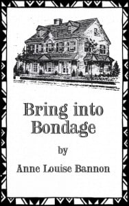
I like the airplane and the burning barn on #2; the airplane gives it a sense of period and the barn gives it a sense of danger. Still, I like #1 best, even though I have no idea how it relates to bringing anything into bondage. It’s an interesting house!
Well, I hope to get a better picture of a shotgun. That’s why these are mock ups. Thanks for the input.
1, 2, 3
Thanks, Larry.
#2. I personally would be attracted to the book by its colorful cover. I would put your name at the top and the title below.
Interesting idea re my name. Thanks for your input.
Number 1, then number 2, and I don’t care for number 3.
Thanks, Rick. That helps.
Guess I am the only one who likes #3 the best, especially the type face used and the color.
That’s okay, Karen. And, actually, you’re not the only one who’s picked that one. Just the only one here.
#1 does not say farmhouse to me( unless it is horse farm in KY). I like the graphics on #2 if you change the gun. But I dislike the color. Like the color combo on 3 but not the graphics. I would pick up a book with the graphics of 2 and the color of the 3.
The gun is getting changed. But your other comments are very interesting. Thanks for the input.
I like #1 best. It seems more fitting to the story/time period. Color work, if it doesn’t “modernize” it. #2 is too busy. #3 isn’t too bad, but I don’t like the rifle image. It’s too modern and not distinctly a rifle. Maybe if a silhouette of a rifle, (not in the broken position, but a straight one), could be superimposed over the drawing of the house in the first cover….
Thanks, Anne. The shot gun over the house sounds interesting.